Towards Convergence – development log #178
Michi made a lot of progress on the upcoming Local Markets feature which in turn relies heavily on the Player Ratings feature. Martin was supposed to work on the latter but got distracted by improving the financial charts in the game. So we have to wait a little bit longer until the two branches converge. Only a matter of weeks, though!

Michi (molp)
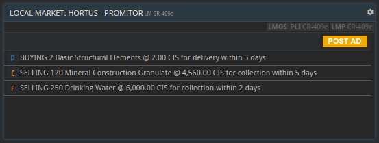
The work on the local markets feature continued this week. Time to show you some early work-in-progress screenshots!

A local market is basically a blackboard with classifieds. Everyone owning a base on the planet can post ads to the local market. The character in front of the ad constitutes the minimum rating your company has to have to in order to accept that ad. Ratings will go from F to A, A being the best achievable rating. Besides these there are also the P and U ratings: pending and unrated.

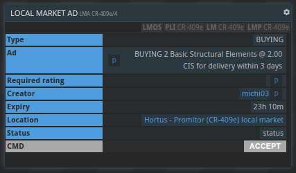
Clicking on an ad reveals a bit more information, for example who created it (including the companies rating), where it was created and how long it is valid. Depending on what the creator set during the creation of the ad it might be visible between one and 30 days. Finally there is a button that allows to accept an ad and forms a contract between the creator and the company accepting the ad. Once the ad has been accepted the contract parties have a certain amount of time to fulfill their respective contractual obligations, like paying, delivering or picking up goods.

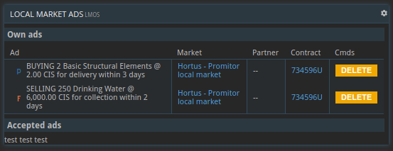
Of course there is a similar command as the existing FXOS and CSOS to show the list of your own ads and the ads of other companies you accepted.

Martin
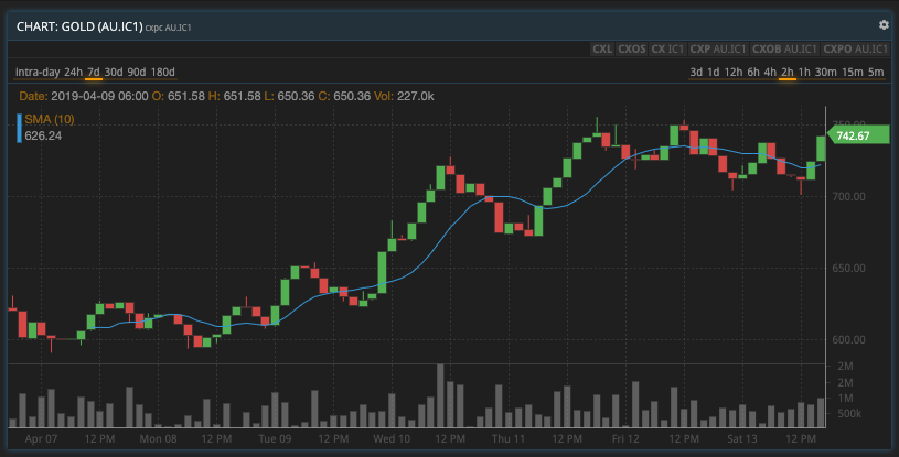
I kind of went off on a tangent this week. My original plan was to get started on the Player Rating feature but I wanted to get a few minor improvements of the price charts out of the way, first. As it’s often the case, that took a lot longer than planned for a variety of reasons. But this is what the charts look like now:

The most notable changes are these:
- You can now select the interval the data points represent.
- In sparse charts, dummy values with zero volume will be displayed to make the chart easier to read.
- The period and interval settings are now stored per tile, so instead of falling back to the defaults, the same settings will be used when you come back to a screen.
- There is now less unused space around the actual chart.
- The volume and price graphs don’t overlap anymore to make them easier to read.
- The volume bars are rendered in grey to make them easier on the eye.
- I’ve added a poof-of-concept “simple moving average” indicator. More of those could be added in the future.
- I fixed a bug that occurred when you had more than one chart on a screen and resized any of them.
The charts are still far from perfect, especially in cases with very little data. But I feel like I’ve spent enough time on them for the moment and should focus on actual game play again :-)
As always: we’d love to hear what you think: join us on the forums!
Happy trading!
Prosperous Universe
Browser-based MMO economy sandbox sim in a realistic sci-fi setting.
| Status | In development |
| Authors | Mjeno, quixoticproject, NickNack |
| Genre | Simulation |
| Tags | browser, business, Massively multiplayer, MMORPG, Multiplayer, online, Sandbox, Sci-fi, User Interface (UI) |
| Languages | English |
More posts
- Prosperous Universe Mobile Release - Development Log #309Nov 12, 2021
- Early Access Launch Week - Development Log #273Feb 24, 2021
- The Universe Expands - Development Log #269Jan 29, 2021
- Winning Back Workers - Development Log #268Jan 20, 2021
- Did Someone Say 'Reset'? - Development Log #267Jan 15, 2021
- YouTubing & Coding Duties - Development Log #265Dec 17, 2020
- 'Ignition' Blasts into Reality - Development Log #264Dec 17, 2020
- Blueprints, Balancing, and Blessings - Development Log #259Nov 05, 2020
- Coming to You LIVE - Development Log #258Oct 27, 2020
- Here Be Pirates - Development Log #257Oct 27, 2020
Leave a comment
Log in with itch.io to leave a comment.